Click the titles to visit each section.
What are brand standards
Visual Elements
Typography
Brand Colors
Color Hierarchy
Type and Color Combinations
Primary
Single Color
Lockups
Proportions
Spacing
Design Style
Stationary Templates Logos
Iconmark
Icon Lockup
Academic Seal
Logo Misuse
Discontinued Logos
Design Elements
Sliding Style Scale
Design Rules
Design Approval
Brand Templates
Brand Voice
How to Use Personality Words
Brand Pillars
The Purpose of Brand Pillars
Mission, Vision, and Values
Branded hashtags
Questions?
Brand standards are rules that explain how our brand should be used. These help us to create a consistent brand image, which is what people will think of when they think of Shepherd.
When comparing products, you likely put thought into the company’s brand image and the values that they represent. The same is true for prospective students looking for a school. A strong, consistent brand image shows people that we are reliable, trustworthy, and a good investment.
Shepherd University’s branding is built on a consistent identity that reflects its values, mission, and professional image. A brand encompasses all aspects of an organization’s identity, including visual elements, messaging, and emotional connection. While a logo serves as a visual representation of the brand, incorporating specific design elements like typography and color palettes, the brand itself is broader, defining how the organization is perceived.

Consistent use of these branding elements ensures a unified visual identity across all platforms, reinforcing trust and professionalism. Shepherd’s brand guidelines create a flexible yet structured approach, enabling individual units to align with the university’s overarching identity while maintaining their unique roles.
A brand (short for brand identity or brand image) is the holistic representation of an organization’s identity, values, and personality, shaped by how it presents itself and is perceived by its audience. While a logo is a key part of a brand, a brand is much broader, encompassing all elements that shape how the organization is experienced and remembered, such as design, communication, and emotional connection. A brand is the story; the logo is the signature. Shepherd University’s brand reflects its commitment to consistency, trust, and value through carefully designed visual elements, voice, and messaging.
The visual identity of Shepherd University includes specific typography, a defined color palette with primary and accent colors, and logos with strict guidelines for proportions and usage. Design elements such as gradients, overlays, and vertical text add visual appeal while maintaining consistency. These standards ensure a cohesive image across all platforms and materials.
The University’s brand voice is direct, welcoming, and forward-thinking, emphasizing personality traits like being encouraging, transformative, and community-focused. Messaging is aligned with Shepherd’s mission to prepare students for lifelong success and its core values of learning, engagement, integrity, accessibility, service, and community. Taglines like “Real World Opportunities, Real Life Ready” encapsulate the University’s essence and differentiate it in a competitive landscape.
Consistency is a cornerstone of the Shepherd brand. By adhering to strict guidelines and approved templates, the University ensures that its branding remains unified and recognizable. This consistency builds trust, creates emotional connections, and helps establish Shepherd University as a reliable and aspirational choice for students, faculty, alumni, and the broader community.
A logo is a visual symbol that represents an organization’s identity, values, and mission. It serves as a cornerstone of branding, creating a recognizable and consistent image that fosters trust and engagement with audiences. At Shepherd University, the logo is an integral part of its brand standards, designed to communicate professionalism, tradition, and a sense of community.
The primary Shepherd University logo combines the wordmark “Shepherd University” in a serif and sans serif typeface with the University’s iconmark. The iconmark features McMurran Hall, symbolizing the institution’s historic roots and commitment to guiding students toward success. This combination creates a visually balanced and meaningful representation of the University’s identity.
Shepherd’s logos are meticulously designed with specific proportions, spacing, and color guidelines.
For example, the primary logo is displayed in full color whenever possible, but single-color versions are used when contrast or specific applications (e.g., metallic foiling) require it. The brand standards also include variations such as vertical and horizontal lockups, ensuring flexibility while maintaining consistency.
To protect the logo’s integrity, Shepherd’s brand standards strictly prohibit unauthorized modifications, including altering proportions, adding elements, or using discontinued designs. This ensures the logo remains a consistent and powerful symbol of the University.
In essence, a logo is not just a visual mark; it is a representation of an organization’s promise, values, and personality. Shepherd University’s logos are crafted to reflect its mission, inspire trust, and resonate with its diverse audiences.
In Shepherd University’s brand standards, a lockup is a customized version of the university’s logo tailored for specific entities, such as colleges, departments, offices, and divisions. Lockups pair the primary Shepherd University logo with identifying text for the unit, separated by a rule line, allowing individual entities to maintain their identity while adhering to the university’s cohesive visual branding.
Each lockup includes the university logo and the entity name set in Montserrat Bold, with proportions and spacing aligned with strict guidelines. Lockups come in horizontal and vertical orientations to accommodate various design needs. To ensure consistency and professionalism, lockup files must be requested through the Division of Communications and Marketing; individual units cannot create their own versions.
Lockups are provided for all colleges, departments, offices, and divisions. Units within these larger entities, such as programs or initiatives, should use the lockup of the broader unit they belong to. For example, the Theater program would use the lockup for the Department of Communications, Contemporary Art, and Theater, aligning its identity with the department’s.
This structured approach ensures that all university communications reflect a unified brand while allowing for flexibility to represent diverse entities.
Lockups create a balance between individual recognition and the strength of the overall Shepherd University brand, ensuring all materials are visually connected to the institution’s trusted and professional image.
An icon is a simplified graphic element that represents an identity in a visually concise way. Within the context of Shepherd University’s brand, the iconmark a stylized version of McMurran Hall over the shape of a shield is a central element of the University’s logo and symbolizes tradition, guidance, and academic excellence. The iconmark visually anchors the brand, making it instantly recognizable even in standalone applications. Icons are versatile and can be used to complement branding in various contexts. At Shepherd University, the iconmark is primarily used as part of the official logo but may appear independently in specific situations where the full logo would be impractical, such as on social media profile images, app icons, or merchandise. For example, when the full logo would be too small to read clearly, the iconmark can stand alone, provided that the text “Shepherd University” appears prominently elsewhere in the design.
The brand standards specify that the iconmark must remain unaltered, with consistent proportions, colors, and spacing to preserve brand integrity. Any use of the icon as a standalone element requires approval from the Division of Communications and Marketing to ensure it aligns with the overall brand strategy.
Icons like the Shepherd University iconmark are vital for reinforcing visual identity. They provide flexibility for branding across digital and physical platforms while maintaining a consistent, professional image. By adhering to the brand guidelines, the iconmark serves as a powerful visual shorthand for the University’s values and mission, connecting all materials to its trusted and enduring identity.


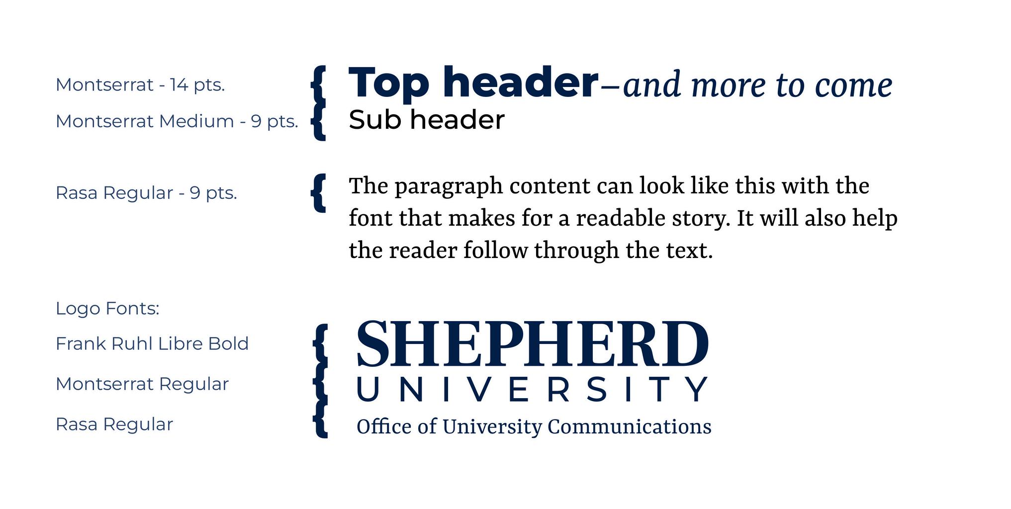
Whennecessary,Playlistscriptcanbeused asanaccentinadesignthathasamore informaltone.Thisfontshouldnotbeused allthetime.
typography
TABLE OF CONTENTS
EyesomeScriptcanbeusedasanaccent inadesignforsemi-formaleventsand invitations.Theuseofthisfontwill createarelaxedyetformaltoneforthe design,andthereforeshouldnotbeused allthetime.
typography
TABLE OF CONTENTS
CitadelScriptcanbeusedasanaccentin adesignforawards,formalevents,and invitationsuites.Theuseofthisfontwill createaformal,eleganttoneforthe design,andthereforeshouldnotbeused allthetime.
typography
Pairs well with rasa
TABLE OF CONTENTS
MonotypeCorsivacanbeusedasanaccent inadesignforawards,formalevents,and invitationsuites.Theuseofthisfontwill createaformal,eleganttoneforthedesign. Thisfontisagoodfitwhenyouare targetingayoungeraudienceorinother caseswhereacursivefontmaybehardto read.Itshouldnotbeusedallthetime.
typography


TABLE OF CONTENTS


Color hierarchy is a visual representation of how often we should use each set of brand colors. While all brand colors contribute to our brand image in a specific way, some will appear more often than others such as gold and navy.
Keep this color hierarchy visual in mind when designing, creating, or otherwise promoting the Shepherd brand.
TABLE OF CONTENTS
Shepherd Gold
HEX: #FABD00
PMS: 7548 C
Shepherd Navy #011E41
PMS: 289 C
Shepherd Blue #2a436d
PMS: 541 C
Shepherd Red #a33940
PMS: 1807 C
Shepherd Green #60671E
PMS: 5757 C
Shepherd Aqua #578c9F
PMS: 7696 C
Accent colors can be used to highlight information and to compliment our primary colors. Utilizing accent colors provides flexibility in graphics while still keeping a consistent and recognizable brand image. The Color Hierarchy Chart shows how often and how much to use accent colors in comparison to other brand colors.
View the Color Hierarchy Chart TABLE OF CONTENTS
Whenplacingtextonabackground,thecolor combinationmustbeaccessibleandeasytoreadin asmallerfontorfromadistance.


ThisistheprimarylogoforShepherdUniversity.Theprimarylogo encompassestheword“SHEPHERD”inaseriftypefaceandthe word“UNIVERSITY”inasansseriftypeface,stackedvertically,to therightofouriconmarkasshown.Theiconmarkisproportionate tothesizeandplacementofthewordmarkandshouldnotbe modified.Thelogoshouldbedisplayedinfullcolorasitappearson thispagewheneverpossible,unlessdisplayedonaShepherdGold background,inwhichcasesinglecolorshouldbeused.
NOTE: Logos files can be downloaded above These files have the necessary proportions and placement and are to remain unaltered. To see more information about the proper proportions and placement, see here.

This is the primarylogo forShepherd University. The primarylogo encompasses the word “SHEPHERD” in a serif typeface and the word “UNIVERSITY” in a sans serif typeface, stacked vertically, above ouriconmark as shown. The iconmark is proportionate to the size and placement of the word mark and should not be modified. The logo should be displayed in full coloras it appears on this page wheneverpossible, unless displayed on a Shepherd Gold background, in which case single colorshould be used.
NOTE: Logos files can be downloaded above These files have the necessary proportions and placement and are to remain unaltered. To see more information about the proper proportions and placement, see here.

When the primary logo appears against a dark background, white lettering should be used for our wordmark. The file labeled for dark mode within the logo files folder should be used when necessary to create better readability. When possible, the iconmark should remain in full color as it appears on this page, unless displayed on a Shepherd Gold background, in which case single color should be used.
NOTE: Logos files can be downloaded above These files have the necessary proportions and placement and are to remain unaltered. To see more information about the proper proportions and placement, see here.

color
The single color logo should be used when appearing on a Shepherd Gold background or on other colors where contrast is low. In some cases, a single color logo may be necessary for print related reasons such as metallic foiling. When the logo must appear in a single color on a light background, the “single color” logo file should be used as it appears on the left.
Note that the white space in the logo has no fill and will therefore take the color of the background.
NOTE: Logos files can be downloaded above These files have the necessary proportions and placement and are to remain unaltered. To see more information about the proper proportions and placement, see here.

primary logo-single color
The single color logo should be used when appearing on a Shepherd Gold background or on other colors where contrast is low. In some cases, a single color logo may be necessary for print related reasons such as metallic foiling. When the logo must appear in a single color on a light background, the “single color” logo file should be used as it appears on the left.
Note that the white space in the logo has no fill and will therefore take the color of the background.
NOTE: Logos files can be downloaded above These files have the necessary proportions and placement and are to remain unaltered. To see more information about the proper proportions and placement, see here.
TABLE OF CONTENTS
Logo lockups provide a customized approach to marketing for different University entities, while still adhering to our brand standards. Lockups should be requested from the Division of Communications and Marketing. Logo lockups will consist of the University logo, a rule line, and the entity name set in all caps Monserrat Bold. The height of the typeface for the entity name will be equal to the height from the bottom of the “E” in “SHEPHERD” to the top of the serif on its leg.
NOTE: Logos files can be requested from the link above or by emailing university-communications@shepherd.edu These files have the necessary proportions and placement and are to remain unaltered. To see more information about the proper proportions and placement, see page 17
The primary Shepherd University logo utilizes visual elements to create a scalable logo that can alway be checked for the proper proportions. As noted in the graphic, the purple measurements show that the distance between the iconmark and the word mark are to be the same horizontal distance as the vertical height of the weather vein in the iconmark. The light blue lines show the alignment of the top of the word “UNIVERSITY” with the tops of the hands on the clocks. The pink boxes represent proportions for the wording in a lockup. The text height of the entity name for a logo lockup will be equal to the height from the bottom of the “E” in “SHEPHERD” to the top of the serif on its leg.
NOTE: This slide is for reference only. Logos files should be downloaded with the necessary proportions and placement and are to remain unaltered. TABLE OF CONTENTS
NOTE: This slide is for reference only. Logos files should be downloaded with the necessary proportions and placement and are to remain unaltered.
The primary Shepherd University logo utilizes visual elements to create a scalable logo that can alway be checked for the proper proportions. As noted in the graphic, the purple measurements show that the distance between the iconmark and the word mark are to be the same horizontal distance as the vertical height of the weather vein in the iconmark. Note that the vertical logo stack aligns the distance between the two pieces from the bottom of the navy in the icon not the bottom of the icon itself. The light blue lines show the alignment of the outer straight edges of the iconmark inner most edges of the “E”s in “SHEPHERD.”
TABLE OF CONTENTS
The distance between the outermost edges of the logo and any other elements should be the equal to the height from the top of the weather vein to the top of the shield.
logo - horizontal spacing
TABLE OF CONTENTS

The distance between the outermost edges of the logo and any other elements should be the equal to the height from the top of the weather vein to the top of the shield.
TABLE OF CONTENTS
Avoid using the iconmark as a standalone image. In some instances, an exception can be made if the usage of the logo may be too small to read the words. For logo use in applications where the words “Shepherd University” would appear less than 3/4 inch long the iconmark can be used as a stand-alone. When approving use of the icon mark as a stand-alone, the words Shepherd University will need to appear in headline text or in another prominent location on the design in question, unless approved in writing by the Division of Communications and Marketing.

NOTE: Logos files can be downloaded above. These files have the necessary proportions and placement and are to remain unaltered.
Icon lockups provide a simplistic version of the lockup, while still adhering to our brand standards. Lockups should be requested from the Division of Communications and Marketing. Icon lockups will consist of the University icon, a rule line, and the entity name set in all caps Monserrat Bold.
NOTE: Logos files can be requested from the link above or by emailing university-communications@shepherd.edu These files have the necessary proportions and placement and are to remain unaltered.
on image or app icon is appear in full color on a nd. If the files for a favicon ease reach out to the ons and Marketing.
Request a Favicon or App Icon File
NOTE: Logos files can be requested from the link above or by emailing university-communications@shepherd.edu These files have the necessary proportions and placement and are to remain unaltered. TABLE OF CONTENTS
Anysocial media account affiliated with the Universityand approved through the Division of Communications and Marketing should use the Shepherd social media profile image style displayed on this page to designate their account as part of the Shepherd familyof accounts. The Division of Communications and Marketing will create this profile image for you. This image is not a logo and is not approved for use outside of the social media profile image. This will help mark content as “officiallyrelated to the University” to the target audience.
NOTE: Logos files can be requested from the link above or by emailing university-communications@shepherdedu. These files have the necessary proportions and placement and are to remain unaltered.

USE ONLY
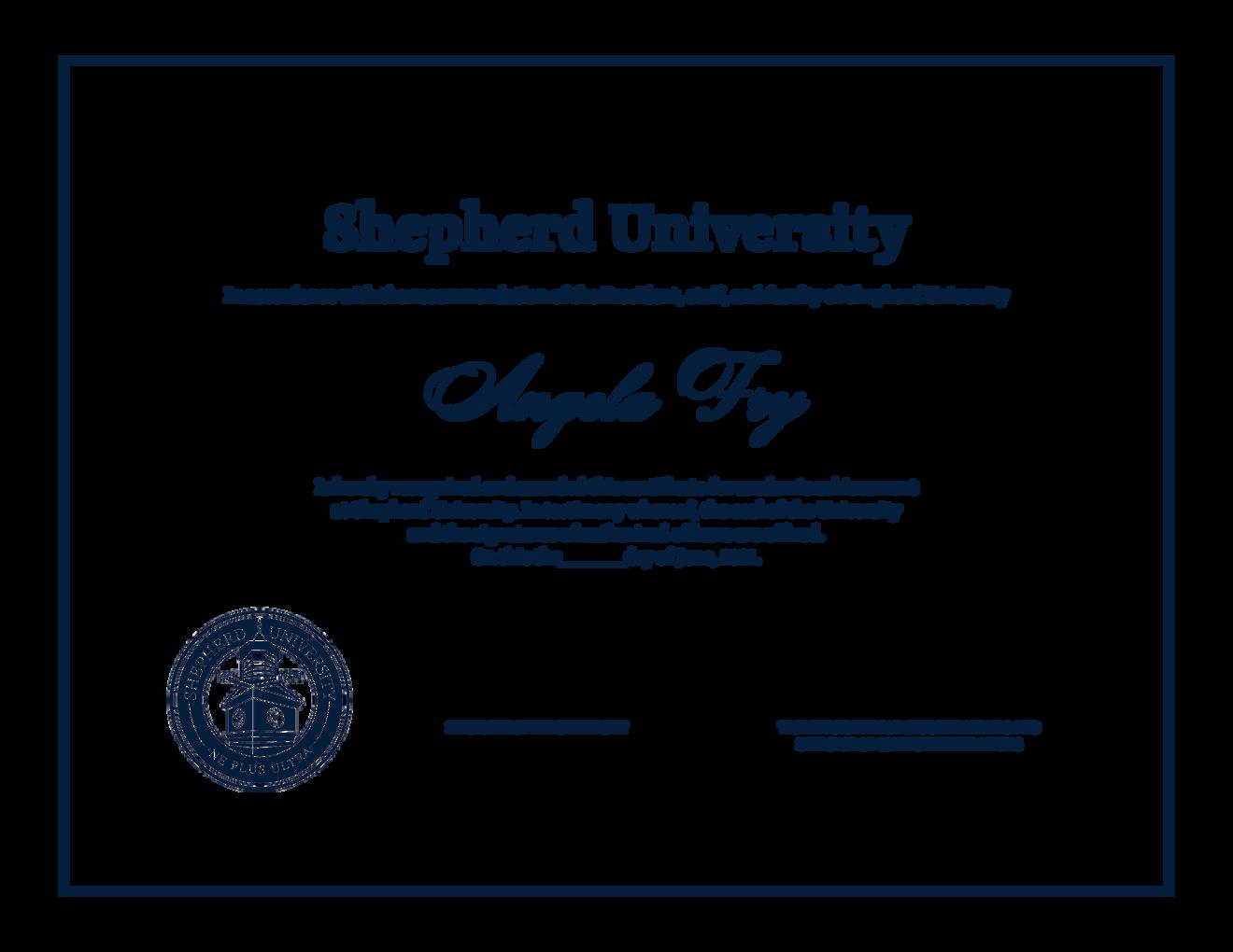
The academic seal should only be used for official University documentation such as certificates, Presidential projects, or other pre-approved projects. The University seal is not authorized for use on projects that have not received written approval from the Division of Communications and Marketing.
NOTE: Logos files can be requested from the link above or by emailing university-communications@shepherd.edu These files have the necessary proportions and placement and are to remain unaltered.
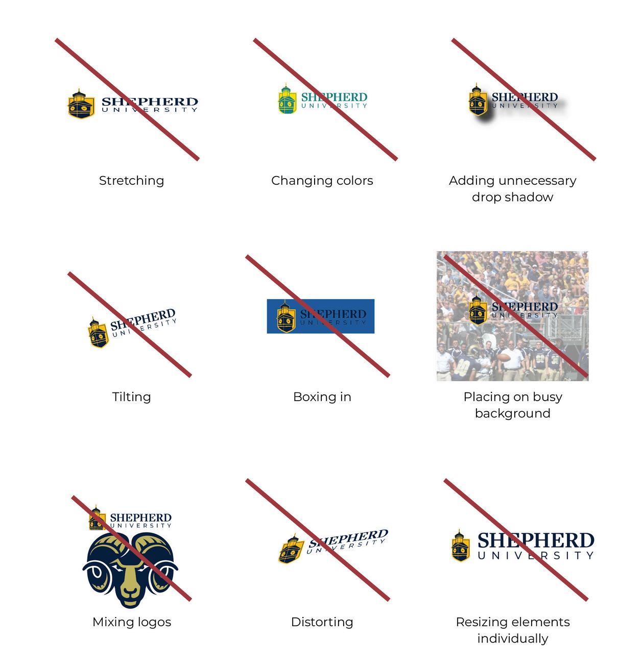
When using any Shepherd University logos, you may not alter the logos in anyway. Logo files are to be used as is and should be used as explained in this guide. Using the logo in any other way, including but not limited to those listed on this page, is considered misuse of the logo and is unauthorized.
TABLE OF CONTENTS


The logos contained on this page are discontinued as of June 3, 2024. Any usage of these graphics in whole or in part, should be removed or replaced as we are able. Any secondary logos (not pictured on this page) for units within the University are also discontinued and will be replaced by the new lockup system.
TABLE OF CONTENTS

Consistent style and repeating elements help make the Shepherd brand recognizable across platforms. The elements that make up our design style can be used together or separately depending on the needs of the design.
The intent of the design should be kept in mind when selecting which elements to use. Design elements should not take precedence over design best practices.
style
TABLE OF CONTENTS
The Shepherd design style utilizes the thin line element to guide the eye around the design and add visual interest. Added visual interest can be added by breaking the line with other design elements.
TABLE OF CONTENTS
style - color overlay
Acolor overlay allows us to create mood and tone in an image. Cutting the subject from an image and laying it overtop of the background color overlay allows for the background to have a certain tone while still highlighting the foreground.
TABLE OF CONTENTS


The gradient overlay element provides a subtle area in a photo to add text. This effect gives a subtle feel to the transition and makes the text pop.
design style - gradient overlay
TABLE OF CONTENTS
design style - tab overlay
Asolid color tab laid on top of an image or background creates a highlighted space to include more information in a design.
TABLE OF CONTENTS


Elements are removed from theirbackground to create bold, eye-catching graphics.
TABLE OF CONTENTS
text
Vertical text is a great way to add visual interest and create a dynamic design.
Keep in mind that vertical text should be for no more than a few words.
TABLE OF CONTENTS
The Shepherd brand is designed to be flexible and accommodate a wide variety of design styles and applications. The sliding scale is a visual tool to show how the brand can be applied to suit the goals of the design. While each notch on the scale can be used as a guide when designing, not every design will align with one specific notch.
design style - sliding scale
TABLE OF CONTENTS
A formal design makes light use of our design elements. This range of designs uses neutral brand colors and simple text hierarchy to make the content fit a formal setting. Designs in this range lend themselves to more elegant matters such as academic achievements, honors, and formal invitations.
Commencement pieces, formal invitation suites, awards, etc.
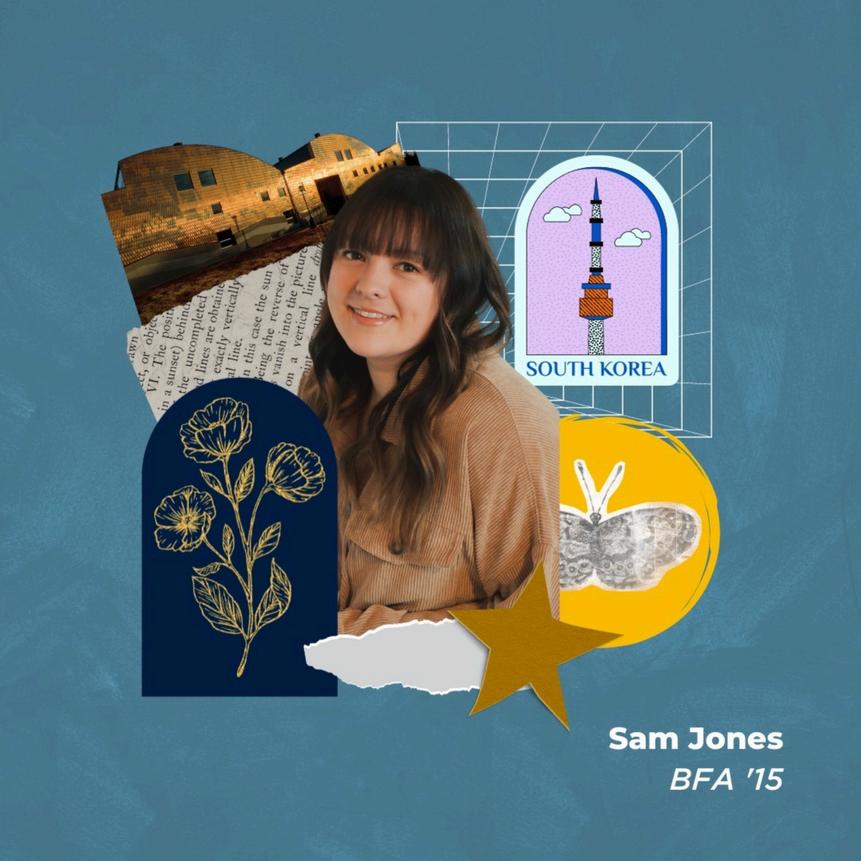
Jennifer Smith


Semi-formal designs may tie in some design elements but will still keep the design clean, modern, and light in visual weight. These designs mostly use neutral colors to convey a more relaxed but formal setting. Designs in this range lend themselves to semi-formal events such as professional correspondence, presentations, and event invitations.
Presentations, events, official communication, etc.

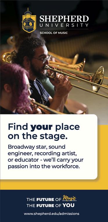
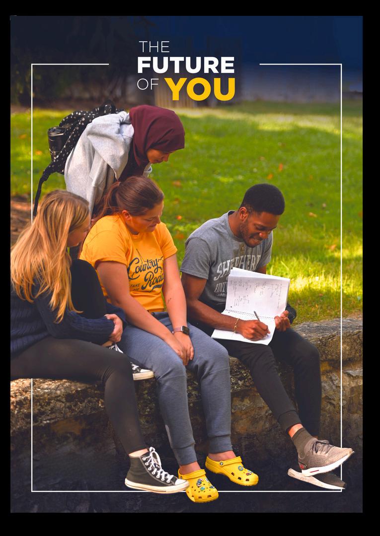
Our standard design style is clean and modern, allowing information to be easily understood. This range of designs makes use of solid colors, photos, and simple text hierarchy to make the content stand out. While some of our graphic elements may be implemented for a cohesive feel, they should be used with purpose.
Admissions pieces, publications, student resources, event promotions, etc.

Semi-bold is a design style that makes images pop and brings content to life. This range of designs makes use of brand colors, elements, photos, and text hierarchy to make the content stand out. Designs created in this style will rely heavily on Shepherd’s visual elements to highlight important information.
Admissions pieces, publications, social media, student resources, event promotions, etc.

Bold design is a more advanced design style that can make your piece stand out. This style makes use of the Shepherd colors and elements in a more creative structure. Due to the creative nature of this style, it is extremely important to keep the brand in mind while designing.
Athletics, social media, etc..

The margins for any design should always be a minimum of the width speciied in the margin formula above. The margins can be wider, but should not exceed double the margin width provided by the formula.
NOTE: In rare instances of large-scale sizing, the margin may need to be adjusted manually
When wording is written in all caps, it should not be longer than 5 words or 45 characters, whichever is longer.
This is filler text that is used to give a visual idea of what justification should look like.
This is filler text that is used to give a visual idea of what justification should look like.
When typing information on multiple lines, alignment is key to readability. When possible, let align the text. Text should not be centered if it is longer than ive lines, as it will decrease readability. Avoid using justiied text, or having even edges on both the let and right. This can create gaps and decrease readability.
This filler text is set to have fully justified spacing. This can create weird gaps and make it hard to read.
style - text alignment
TABLE OF CONTENTS
When a unit of Shepherd University is working with another internal or external group, business, or organization, we will need to recognize the partnership on advertising collateral. When two or more University ailiated entities are working together, do not use individual lockups. The Shepherd University logo can be used with sponsorship language used in the example on the right.


TABLE OF CONTENTS
All public-facing promotional material must be reviewed and approved by the Division of Communications and Marketing.
To request design review and approval, fill out our online project request form at www.shepherd.edu/design-approval. TABLE OF CONTENTS
design style - approval
Foryourconvenience,thesetemplatesare pre-formattedtofitourbrandstyle.You maydownloadthemtouseforyourcontent.
VIEW FULL TEMPLATE LIBRARY

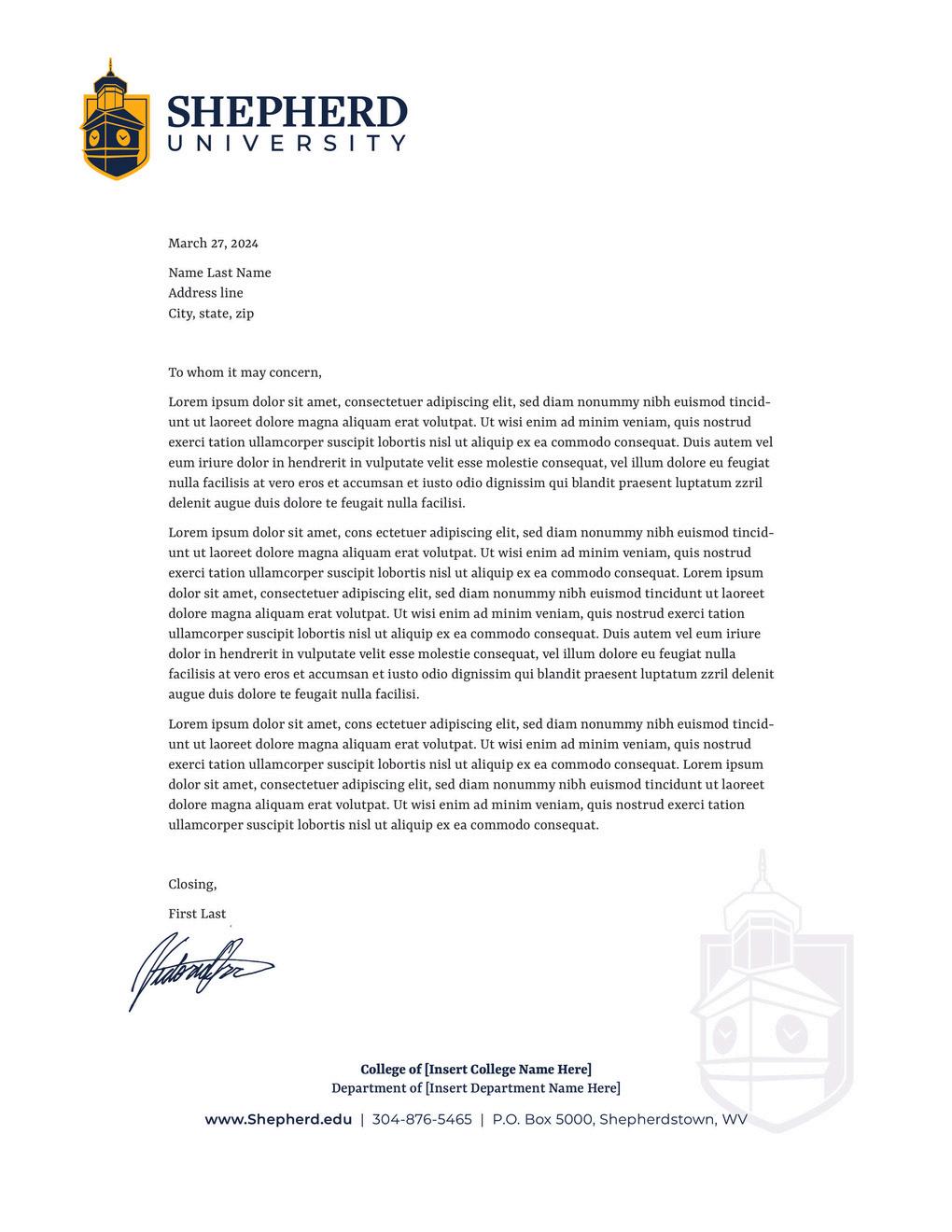
Stationarytemplateshavebeencreatedtohelpyouimplementyour brandthroughyourworkcommunication.Theletterheadtemplateis setupasatemplatefilethatcanbeedited.Youcandownloadthefile andeditthebodycontenttocreateyourletter.Theheaderandfooter shouldNEVERbeedited. Ifyouneedbusinesscardsorenvelopes,pleaseorderonlinethrough ourprintportalatwww.shepherd.edu/printorder.

TABLE OF CONTENTS
Personality words are adjectives that resonate with our brand. These adjectives help us visualize Shepherd University when determining and targeting our audience, developing messaging, and creating a visual aesthetic.
Keep these personality words in mind when deciding on the tonality of your copy and the visual elements of your design.
TABLE OF CONTENTS
Forward-thinking
Compassionate not brash not authoritative not overzealous not overbearing not antiquated not radical not opportunistic
TABLE OF CONTENTS
Brand pillars are fundamental characteristics that set us apart from our competitors. These characteristics make up the identity of Shepherd University. When people think about our institution, we want them to have these brand pillars in mind.
Brand pillars guide our communication and messaging efforts.
TABLE OF CONTENTS
Shepherd University is a premier public university, grounded in the liberal arts and sciences, that prepares students for lifelong learning and success in their chosen pursuits and serves as a hub for academic, cultural, and economic opportunity.
Shepherd University will be a first-choice academic home with high-quality and innovative programs that position our diverse community of students and alumni for success as global citizens and leaders.
TABLE OF CONTENTS
Learning. Shepherd University is home to a community of learners who use scholarship, critical thinking, and curiosity to make meaningful contributions to the university and the world. Through rigorous coursework, experiential learning, and mentorship, we teach our students to lead by example. As a university, we serve our community and forge new paths in higher education.
Engagement. Shepherd University encourages students, faculty, staff, and members of the community to engage with diverse people, experiences, beliefs, and ideas, which promote critical analysis, intercultural competence, and self-expression. Exploration of intellectual, creative, service, athletic, and leisure pursuits is encouraged, having a cascading effect on the well-being of the participants, the campus community, the surrounding region, and the world.
Integrity. Shepherd University strives for an environment of honesty and fairness. University officials seek input from students, faculty, and staff in making informed and objective decisions that benefit the campus community. We expect all members of our community to act with integrity, respect, accountability, and honesty.
Accessibility. Shepherd University, in its commitment to respect and inclusion, strives to create a fully accessible campus. University governance and budgeting structures reflect our commitment to providing affordable educational programs and facilities through transparent, equitable processes and public access to information.
Service. Shepherd University sees itself as an integral part of its community, and we prioritize giving our time and talent to a variety of worthy initiatives. Besides providing service opportunities campus wide, we encourage our campus community to volunteer for the causes that are important to them.
Community. Shepherd University fosters a community built on respect, support, and the celebration of our similarities and differences. We embrace diversity of thought and identification and strive to create a safe environment where everyone is welcome. Our commitment to equity and inclusion is reflected in all we do. We treasure our ties to Shepherdstown and our surrounding communities, where we prioritize service, stewardship, and citizenship.
TABLE OF CONTENTS

Below is a list of our branded hashtags and their expected usage:
#ShepherdU - all Shepherd University-affiliated content; should be listed first
#SURamFam - content featuring prospective students, current students, and alumni or to emphasize community
#TheFutureofYOU - recruitment and admissions initiatives
#RamNation; #GoRams - content relating to Shepherd University Athletics
#OnceARamAlwaysARam - content relating to alumni, commencement, and recruitment
#SURamGrad - content relating to Commencement
#ShepherdServes - content featuring student service and volunteering
#ShepherdStudentsSucceed - content featuring student success stories or relating to the Student Success Center/Alumni Association
#GetRamReady – recruitment and orientation initiatives
#ShepherdNews – press releases and news pieces